

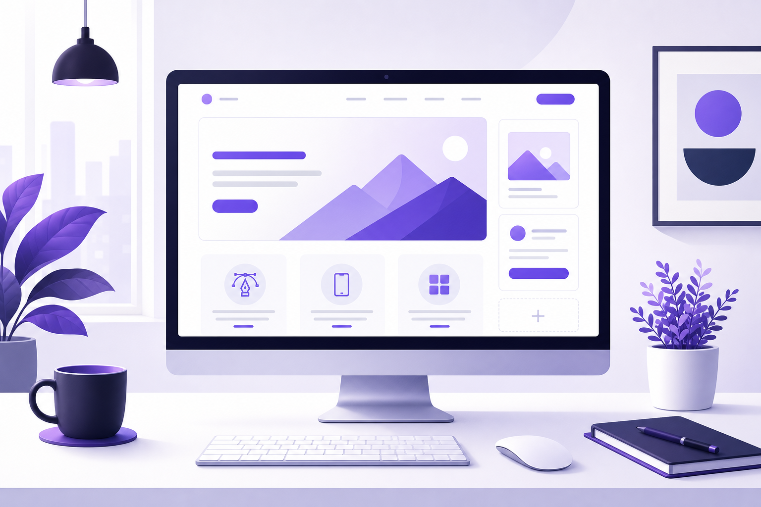
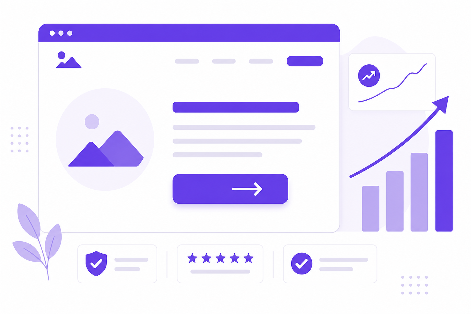
Your website is often the first interaction a potential customer has with your brand. In 2026, a well-designed website is no longer a nice-to-have — it is a strategic asset that directly influences revenue, trust and search visibility. Whether you are a startup founder in Austin, a retail brand in London or a SaaS company in Sydney, following the best web design practices separates businesses that grow from those that stagnate.
This guide covers the most impactful design principles, performance benchmarks and user experience strategies you should implement this year. Every recommendation is grounded in real data and current industry standards.
Why Web Design Matters More Than Ever in 2026
First impressions are ruthlessly fast on the web. Research from the Nielsen Norman Group suggests that users form an opinion about a website within roughly 50 milliseconds of landing on it (Nielsen Norman Group, 2023). That fraction of a second determines whether someone stays to learn more — or bounces to a competitor.
Beyond aesthetics, web design now directly affects your position in search results. Google’s ranking algorithms factor in page experience signals such as loading speed, visual stability and interactivity (Google Search Central, 2024). Businesses that invest in modern, standards-compliant web design consistently outperform competitors who treat their website as an afterthought.
For small businesses and startups, your website is also your most scalable salesperson. Unlike paid ads that stop the moment you pause your budget, a well-designed site with strong SEO and digital marketing foundations compounds organic traffic month after month.
Mobile-First Responsive Design
According to Statcounter, mobile devices accounted for approximately 60% of global website traffic in early 2026 (StatCounter, 2026). Google uses mobile-first indexing, meaning the mobile version of your site is the primary version evaluated for ranking. If your site is not optimized for mobile, you are invisible to more than half your potential audience.
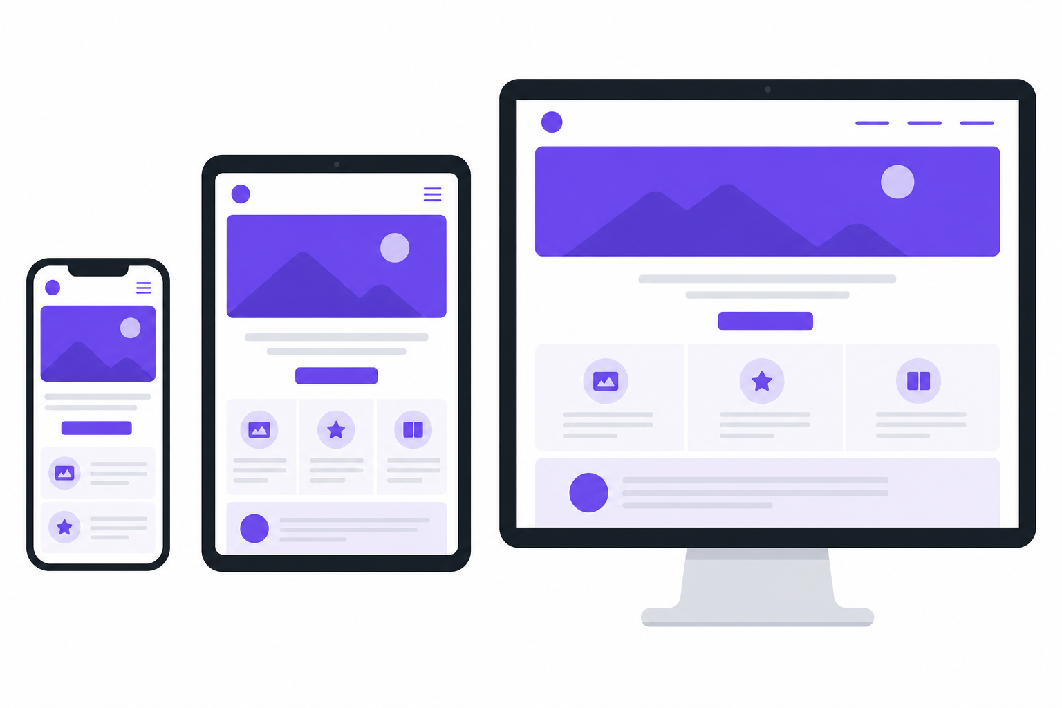
Key Mobile-First Principles
- Start with the smallest screen. Design for a 320px viewport first, then scale up using CSS breakpoints. This forces you to prioritize content hierarchy and remove clutter.
- Touch-friendly targets. Buttons and links should be at least 44×44 pixels, as recommended by Apple’s Human Interface Guidelines and Google’s Material Design specifications.
- Fluid grids and flexible images. Use relative units (
%,rem,vw) instead of fixed pixel widths so layouts adapt gracefully to any screen size. - Avoid intrusive interstitials. Full-screen pop-ups on mobile hurt usability and can trigger ranking penalties from Google.
If your current website was designed desktop-first and simply scaled down, consider a ground-up responsive redesign. Our web design and development team builds mobile-first from day one using modern CSS Grid and Flexbox layouts.
Core Web Vitals and Page Speed Optimization
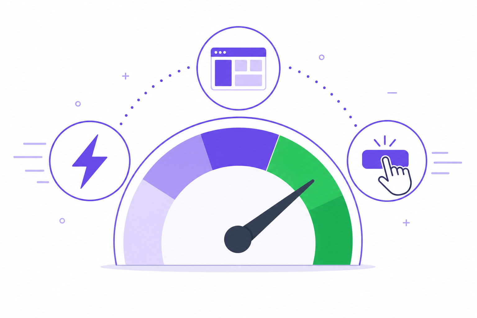
Google’s Core Web Vitals are a set of three metrics that measure real-world user experience on your website (web.dev, 2024):
- Largest Contentful Paint (LCP) — measures how quickly the main content loads. Target: under 2.5 seconds.
- Interaction to Next Paint (INP) — measures responsiveness to user input. Target: under 200 milliseconds.
- Cumulative Layout Shift (CLS) — measures visual stability. Target: under 0.1.
Practical Speed Improvements
- Compress and serve images in modern formats. WebP and AVIF can reduce image file sizes by 25–50% compared to JPEG or PNG without noticeable quality loss.
- Defer non-critical JavaScript. Use the
deferorasyncattributes on script tags and lazy-load third-party widgets like chat and analytics. - Leverage browser caching. Set long-lived cache headers for static assets (CSS, JS, fonts, images) so returning visitors load pages almost instantly.
- Use a Content Delivery Network (CDN). A CDN like Cloudflare or AWS CloudFront serves assets from edge servers closest to your users in the USA, UK or Australia, cutting latency significantly.
- Minimize CSS and eliminate unused rules. Large CSS frameworks ship thousands of lines your pages never use. Audit and purge unused styles regularly.
Page speed is not a one-time fix — it requires ongoing monitoring. Tools like Google PageSpeed Insights and WebPageTest provide actionable audits you should run at least monthly.
Accessibility and Inclusive Design
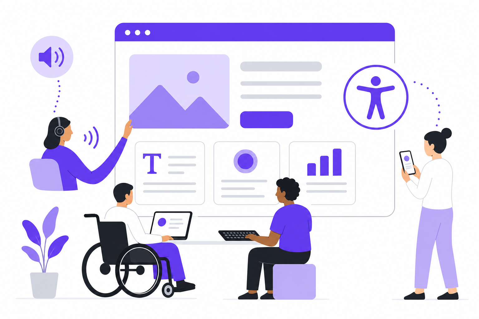
Web accessibility ensures that people with disabilities — visual, auditory, motor or cognitive — can use your website effectively. Beyond the ethical imperative, accessibility has legal weight. In the United States, the number of ADA-related web accessibility lawsuits has grown year over year, according to data compiled by accessibility firm UsableNet (UsableNet, 2024). The UK’s Equality Act and Australia’s Disability Discrimination Act impose similar requirements.
WCAG 2.2 Essentials
The Web Content Accessibility Guidelines (WCAG) 2.2 standard from the W3C is the benchmark every business website should meet at the AA level (W3C, 2023). Key requirements include:
- Sufficient color contrast. Text must have a contrast ratio of at least 4.5:1 against its background.
- Keyboard navigability. Every interactive element (links, buttons, forms) must be reachable and operable using only a keyboard.
- Descriptive alt text for images. Screen readers depend on alt attributes to convey visual information to users who cannot see the screen.
- Focus indicators. Visible outline styles on focused elements help keyboard and assistive-technology users know where they are on the page.
- Semantic HTML. Use the correct heading hierarchy (
<h1>through<h6>), landmark roles (<nav>,<main>,<footer>) and ARIA labels when native semantics are insufficient.
Accessibility also improves SEO. Search engines rely on the same semantic structure and alt text that assistive technologies use. A well-structured, accessible site is a better-ranking site.
Conversion-Focused Design Principles
A beautiful website that does not convert visitors into leads or customers is a missed opportunity. Conversion-focused design aligns every visual element, layout decision and content block toward a measurable business goal.
1. Clear Visual Hierarchy
Guide the visitor’s eye from headline to supporting copy to call-to-action (CTA). Use size, weight, color and whitespace to signal importance. Your primary CTA should be the most visually prominent element on any given screen.
2. Reduce Friction in Forms
Every additional form field reduces completion rates. Ask only for the information you truly need at the first touchpoint. Progressive disclosure — collecting more data in later interactions — keeps initial conversion barriers low.
3. Build Trust with Social Proof
- Client logos and case study thumbnails
- Verified review ratings from platforms like Google or Trustpilot
- Specific outcome metrics (e.g., “200+ projects delivered across three continents”)
4. Strategic CTA Placement
Place CTAs where intent is highest: after explaining a benefit, at the end of a case study, and in a sticky header or floating bar on mobile. Every page on your site should have a clear next step for the visitor.
Need help turning your website into a conversion engine? Get in touch with our team for a free design consultation.
Visual Design Trends Shaping 2026
While trends come and go, several visual directions have proven staying power heading into 2026:
- Bento grid layouts. Inspired by dashboard UIs, bento grids organize content into modular, card-based sections that are easy to scan and naturally responsive.
- Generous whitespace. Breathing room between sections improves readability and gives premium brands the editorial feel they need.
- System and variable fonts. Performance-conscious teams are moving away from heavy web font files. Variable fonts offer multiple weights in a single file, reducing load time without sacrificing typographic flexibility.
- Subtle micro-interactions. Hover effects, scroll-triggered reveals and button state animations provide feedback that makes interfaces feel responsive and polished — when used with restraint.
- Dark mode support. Users increasingly expect dark mode options. CSS
prefers-color-schememedia queries make it straightforward to serve an alternative palette automatically. - AI-personalized content. Dynamic sections that adapt messaging, imagery or product recommendations based on visitor behavior or location are becoming mainstream for e-commerce and SaaS sites.
The key is to adopt trends that serve your business goals and user needs — not to chase novelty for its own sake. A disciplined design system that reflects your brand identity will always outperform a trend-chasing redesign.
Frequently Asked Questions
What are the most important web design trends in 2026?
The most impactful trends include mobile-first responsive layouts, Core Web Vitals optimization, WCAG 2.2 accessibility compliance, AI-personalized user experiences and conversion-focused design systems. Rather than chasing aesthetic trends, the biggest returns come from design decisions that improve speed, usability and business outcomes.
How much does professional web design cost for a small business?
Professional web design for a small business typically ranges from $3,000 to $15,000, depending on the number of pages, custom functionality, integrations and ongoing maintenance requirements. Template-based solutions start lower, while fully custom builds with content strategy and SEO can exceed $20,000. Explore our service tiers for transparent pricing guidance.
Why is mobile-first design essential for business websites in 2026?
Mobile devices generate over 60% of global web traffic, and Google uses mobile-first indexing, meaning the mobile version of your website is the primary version that determines your search ranking. A mobile-first approach ensures faster load times, higher engagement and better conversion rates across every device.
How often should I redesign my business website?
A full redesign every 3–4 years is typical, but continuous improvement is more effective. Monitor Core Web Vitals quarterly, run conversion rate tests monthly and refresh content regularly. If your bounce rate is climbing or your design no longer reflects your brand positioning, it is time to act sooner.
What is the difference between UX design and UI design?
UX (user experience) design focuses on the overall journey a visitor takes — information architecture, task flows and usability. UI (user interface) design handles the visual layer: typography, color palettes, spacing and component styling. Both disciplines work together. Effective web design requires strong UX foundations before the UI layer is applied.
Ready to Upgrade Your Web Presence?
The best web design practices in 2026 come down to three pillars: speed, accessibility and conversion. Every pixel, every interaction and every line of code should serve your visitors and your bottom line. Whether you need a mobile-first redesign, a Core Web Vitals audit or a full-stack build from scratch, Veltrix Tech’s web design and development services are built to deliver measurable results for businesses across USA, UK and Australia.
Let’s build something that grows your business.
References
- Nielsen Norman Group. “How Long Do Users Stay on Web Pages?” nngroup.com, 2023.
- Google Search Central. “Understanding page experience in Google Search results.” developers.google.com, 2024.
- StatCounter. “Desktop vs Mobile vs Tablet Market Share Worldwide.” gs.statcounter.com, 2026.
- web.dev. “Web Vitals.” web.dev, 2024.
- UsableNet. “Web Accessibility Lawsuits on the Rise.” blog.usablenet.com, 2024.
- W3C. “Web Content Accessibility Guidelines (WCAG) 2.2.” w3.org, 2023.